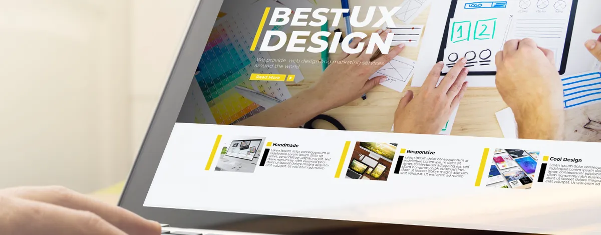
Think of the top part of your website as the front page of a newspaper: vibrant, compelling, impossible to ignore. This ‘above-the-fold’ content is your chance to make a splash in the big leagues of digital engagement. It’s not merely about the aesthetics; it’s a strategic game of blending SEO prowess with the science of conversion.
So, if you want to not only attract an audience but also keep them engaged, nailing this component of your website is essential. It’s about striking the correct mix to convert casual browsers into captivated readers.
What Is Above the Fold on a Website?
“Above the fold” comes from newspaper terminology, describing the top stories placed on the upper half of the front page, visible without unfolding. In web design, it’s the section seen before scrolling. This key area is essential for grabbing visitor interest from the start.
This section’s Click-Through Rate (CTR) gauges how well your content persuades readers to click on links or take action during that first look. Strong content that entices visitors to stay on your website is indicated by a high CTR.
Does Above the Fold Marketing Affect SEO?
The function of above-the-fold content in SEO is about powerful impact rather than just visibility. In addition to drawing attention, including important information and interesting content at the top of your page greatly reduces bounce rates and lengthens the amount of time visitors spend on it.
These metrics are vital for SEO, serving as signals to search engines that your content is not just visible but invaluable, worthy of higher standings. Google values how above-the-fold content immediately fulfills user needs.
Making each pixel count boosts both user experience and your SEO efforts, ensuring your website’s first impression is powerful and SEO-enhanced, setting the stage for richer engagement and superior search presence.
Above the Fold Website Example

Let’s shine a spotlight on what makes the top of your website a true conversion catalyst. Think of this space as your display window where what’s visible can either invite visitors in or leave them walking by. To get it right, let’s unpack some stellar examples of websites that truly nail this crucial view:
-
Clear Call to Action: Think of a website like Shopify. Right when you land, it’s all there: the value proposition and the inviting “Start free trial” button, making it super easy for visitors to engage without scrolling.
-
Engaging Media: Amazon sets a prime example with its carousel of products. This not only captures attention immediately but also encourages visitors to stay and explore, which is great for SEO as it increases dwell time.
-
Simplified Navigation: Apple’s website exemplifies minimalistic navigation at the top of the page, focusing user attention on innovative product images and key announcements. This clean approach helps users find what they need without overwhelming them, enhancing the user experience and SEO by reducing bounce rates.
-
Headlines and Keywords: The New York Times features impactful headlines and compelling subheadings right above the fold, drawing readers into the articles. This strategy is not only user-friendly but also aligns well with SEO practices by incorporating relevant keywords that improve search visibility.
Above the Fold Website Size: Why It Matters
Understanding the perfect above-the-fold area on your website is like fitting into the right suit, it should look tailored on every device. Ensuring elements around this area are all optimally sized means your key messages greet every visitor right at the digital doorstep. Here’s how you can make your website not just seen but also felt right at the first glance.
-
Optimal Dimensions: Aim for dimensions that capture attention efficiently. A good rule of thumb is keeping essential content within 600x400 pixels to ensure visibility without scrolling.
-
Responsive Design: Adaptability is key in today’s multi-device world. Your site should look great and function well whether it’s accessed from a desktop or a smartphone. Responsive design ensures your above-the-fold content adjusts seamlessly across all devices.
-
Visual Balance: Mixing the right amount of text and imagery is crucial. Overwhelming your visitors with too much information or too large images might push important content below the fold. A well-balanced layout engages viewers without needing to scroll.
Above the Fold Email: Optimizing Your Email Marketing

When it comes to emails, that first glimpse above the fold is like the hook of a catchy song, it’s what keeps your audience from skipping. Think of it as your email’s elevator pitch; it needs to be sharp, engaging, and packed with value. Here’s how to ensure your emails not only get opened but also get read:
-
Instant Appeal: Begin with a strong header or headline that promises value. Think of it as your email’s hook: what will make your reader stop and pay attention?
-
Clear Call to Action: Place your primary call to action (CTA) prominently above the fold. Make it easy for readers to understand what you want them to do next, whether it’s to read more, register, or make a purchase.
-
Engaging Preview Text: Utilize the preview text effectively. It’s the snippet of content that appears next to your subject line and helps decide whether an email gets opened. Make it enticing and directly related to your main message.
-
Visually Pleasing Design: Include attractive visuals or well-placed logos that support your message but don’t overcrowd your space. A clean, organized layout helps focus the reader’s attention where you want it.
Maximizing Above-the-Fold Impact with Meta Ads and Coheseo
Are you prepared to create an amazing first impression for your website? With Coheseo, you can transform that vital above-the-fold space into a conversion-pulling powerhouse by adding some marketing magic to your Meta Ads configuration.
With ad-to-page alignment magic, real-time insights, and automated scans, Coheseo doesn’t just help your ads look good, it makes them work harder, smarter, and faster. Try Coheseo, and turn every visitor’s first glance into a lasting impression. Sign up today and give your content the boost it deserves!

 Coheseo


